
Instagram Posts: Ready-to-Share Listing Images
No matching results on this page
Try a different word, or clear the search box.
Turn any listing into a ready-to-post picture, in English or Arabic, without opening a design tool. Pick the property, pick the size, download — the caption is written for you at the same time.
One click from the property, three sizes per post, five designs (or draw your own by dragging blocks onto a canvas), a design per property type, and captions built from the listing itself. Arabic is properly bilingual throughout — laid out right to left, not just translated.
The screenshots on this page are from Wide's own demo account, used only to show what each screen looks like — not your data. Once the feature is on for you, every screen shows your own listings, your own branding, and your own design exactly as you set it up.
| Where | What it is |
|---|---|
| Setup → Properties → Instagram Posts | The settings screen: design, branding, fonts, colours, details, captions. |
| The image button on a property | Where posts are actually made. Opens the post window for that listing. |
The settings screen only appears in the menu when the feature is switched on for you — see section 3.
The image button, above a property's photo
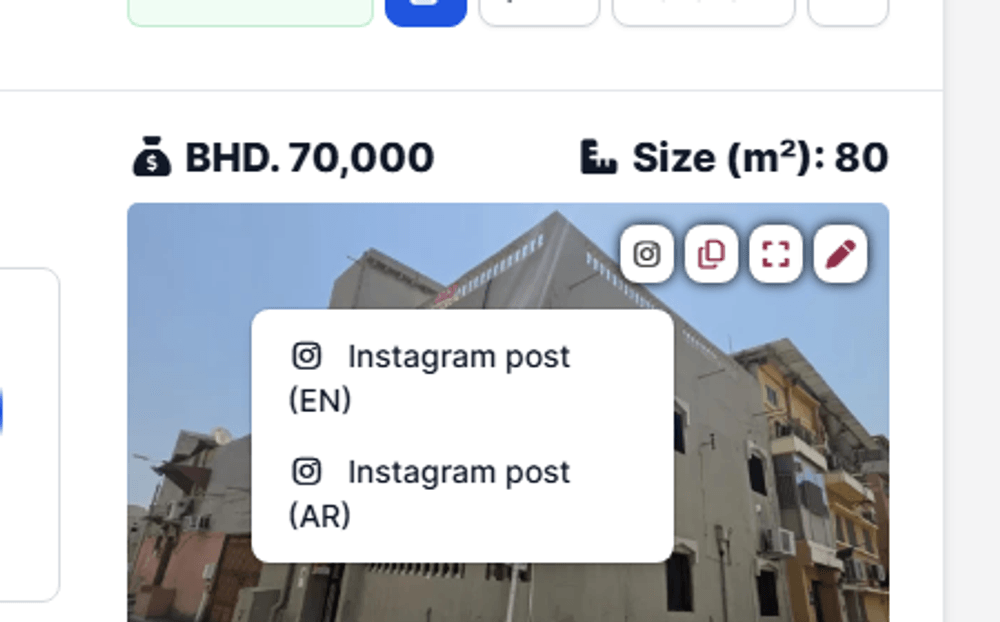
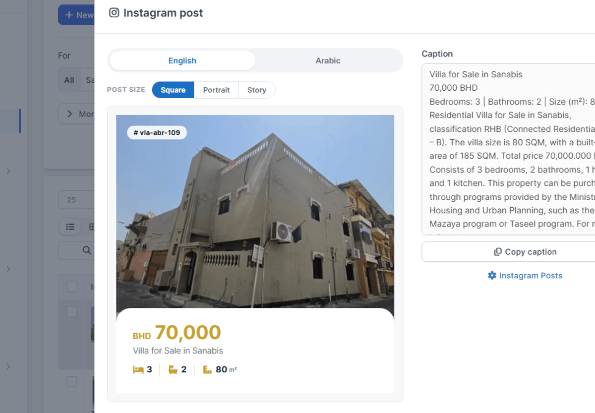
Open a property, click the image button above the photo, and choose Instagram post (EN) or (AR). A window opens with the post already drawn.
The post window — English
The same post — Arabic
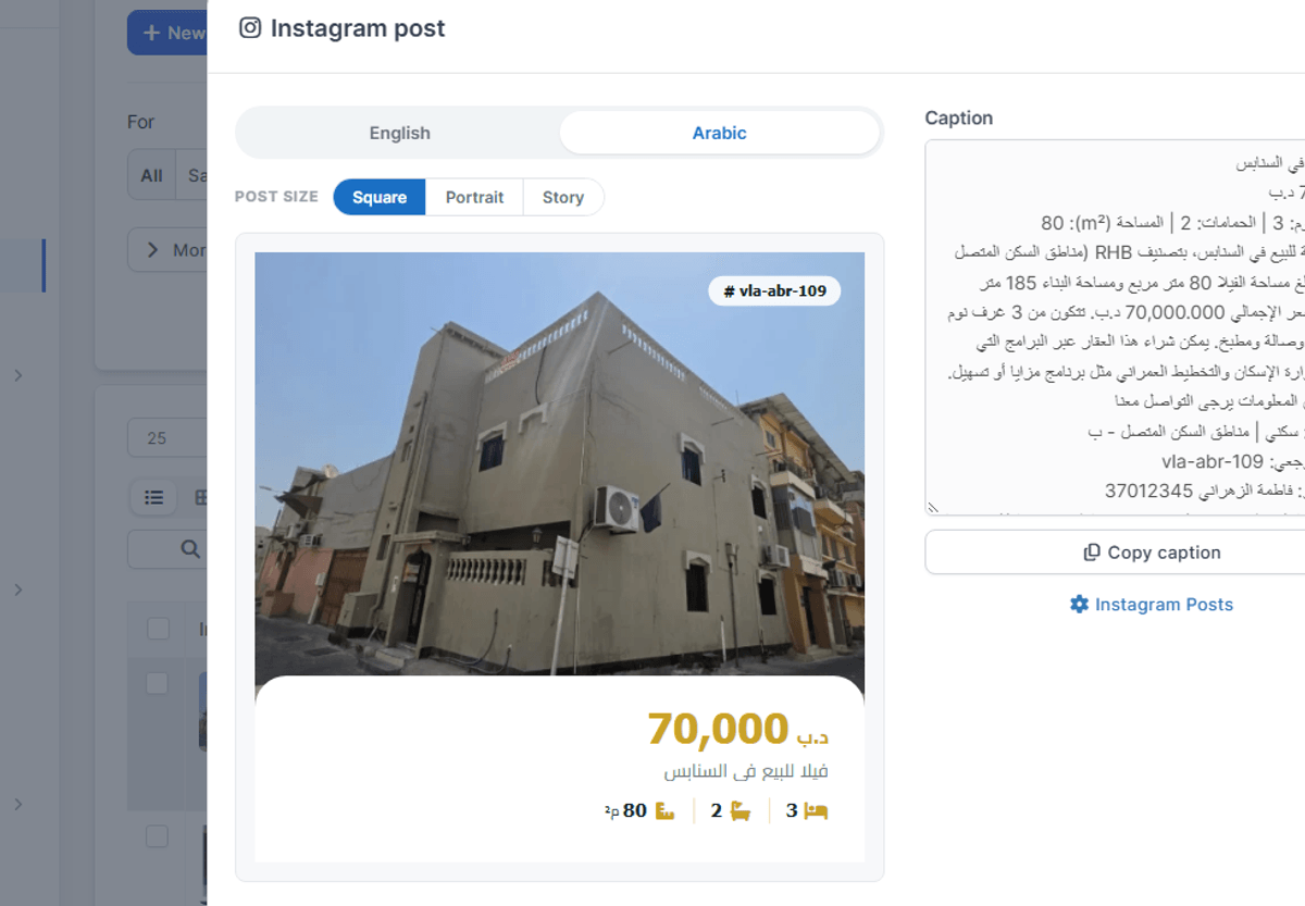
Switching languages redraws the whole post — icons, alignment, and caption together, not just the words.
| Control | What it does |
|---|---|
| English / Arabic | Redraws the post in that language, including the caption. |
| Square / Portrait / Story | 1080×1080, 1080×1350, 1080×1920. Each has its own layout. |
| Download PNG | Saves the picture at full size. |
| Copy caption | Copies the caption text, ready to paste into Instagram. |
The file is named so you can find it again later:
Nothing is uploaded or posted for you. The picture is drawn in your browser and saved to your computer — posting stays a human decision.
If a listing is missing something: a block with nothing to show is left out rather than drawn empty. A property with no licence QR prints no QR and no blank square where one would have been — the rest of the post closes up around it.
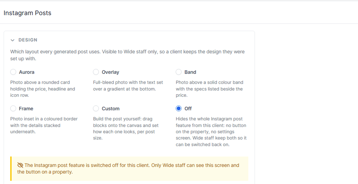
The feature arrives switched off
Wide staff switch it on for you and pick which design your posts use, because a design is something we set up with you rather than a preference to browse on your own. While it is off, nobody at your company sees the settings screen or the button on a property.
The Design panel, while the feature is off
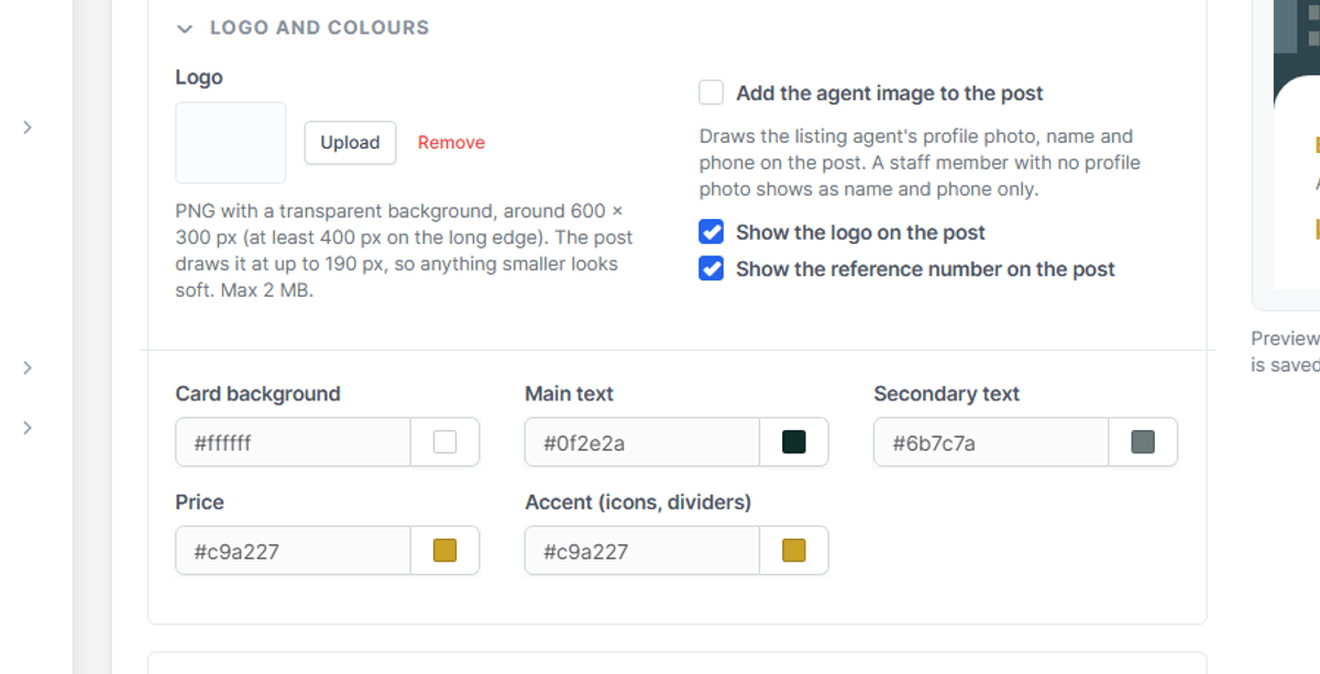
Your first task once it's on: add your logo and set your colours
Before your first real post, open the Logo and colours panel (section 5) and upload your logo and pick the colours that match your branding. This is a one-time setup — every post after that uses it automatically, so nobody has to touch it again per listing.
The Logo and colours panel — do this first
| Design | What it looks like |
|---|---|
| Aurora | Photo above a rounded card holding the price, headline and a row of icons. |
| Overlay | Full photo with the text over a gradient at the bottom. |
| Band | Photo above a solid colour band, specs listed beside the price. |
| Frame | Photo inset in a coloured border, details stacked underneath. |
| Custom | Your own design, made in the layout editor (section 8). |
| Off | Hides the whole feature from your company. |
The four shipped designs read your branding and colours from the settings screen below. Custom does whatever you drew.
Choosing Aurora, with a live sample preview alongside
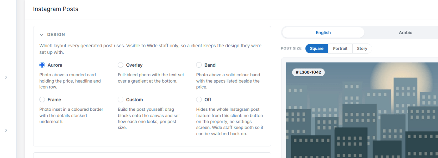
The panels are collapsible and remember whether you left them open. A sample post previews beside them, so every change is visible before it reaches a real listing.
| Panel | What it holds |
|---|---|
| Design | Which design your posts use, and the Off switch. Wide staff only. |
| Custom layout | The link into the layout editor. Only shown when the design is Custom. |
| Logo and colours | Your logo, whether the logo, reference and agent appear, and the colour pickers. Only the colours the chosen design actually paints with are shown. |
| Fonts | An English face and an Arabic face, each with a size scale from 60% to 160%. |
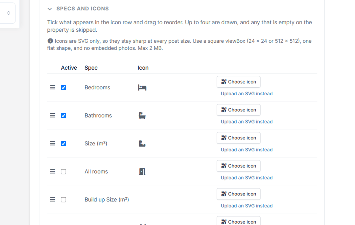
| Specs and icons | Which details appear on a post, in what order, and the icon for each. |
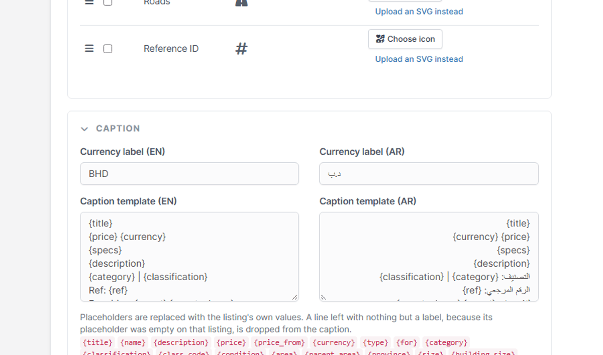
| Caption | The English and Arabic caption templates — section 7. |
| Image cache | How much disk the inlined pictures are using, and a button to clear it. |
Fonts: four Latin faces (Inter, Poppins, Roboto, Cairo) and three Arabic ones (Cairo, Tajawal, Almarai) ship with the module. You can also upload your own .ttf, .otf, .woff or .woff2 for either language, up to 2 MB.
Colours: seven of them — background, main text, muted text, price, accent, overlay and on-photo. Each is a picker that writes a hex value, and a custom layout can point a block at one by name rather than a fixed colour, so changing Price here changes it everywhere a design used it.
A detail is one fact about the listing: bedrooms, size, price per square foot. The catalogue is:
Bedrooms counts master rooms as bedrooms. All rooms adds maid rooms on top, matching the Total Rooms figure on the property form.
Each detail carries an icon: either one picked from the Font Awesome list, or an SVG you upload. Uploaded artwork is cleaned on the way in, so an SVG cannot carry anything but drawing. A detail switched off here still exists — a custom design can place it directly (section 10).
The Specs and icons panel
The caption is a template you write once, with placeholders the listing fills in. Lines whose placeholders all come back empty are dropped, so a listing with no facilities does not print an empty "Facilities:" line.
| Group | Placeholders |
|---|---|
| Identity | {title} {name} {type} {for} {category} {classification} {class_code} {ref} {parcel} |
| Money | {price} {price_from} {price_ft} {currency} |
| Size and rooms | {size} {building_size} {beds} {rooms} {baths} {floors} {flats} {parking} {roads} |
| Place | {area} {parent_area} {province} |
| The rest | {description} {facilities} {condition} {specs} {agent} {agent_phone} {link} {hashtags} |
{hashtags} builds tags out of the listing's own type, area and category, so you are not writing them per post. {link} points at the listing's page on your public website when it is published there, and falls back to a share link when it is not.
The Caption panel
With Custom selected, the settings screen offers Open the layout editor — this is where a design is drawn.
The canvas
The post at true size, scaled to fit. Drag a block to move it, drag a handle to resize it. Blocks snap to the canvas edges, the centre lines and each other; hold shift while dragging to ignore snapping.
| Panel | What it does |
|---|---|
| Add a block | The palette, grouped into Media, Listing and Company. |
| Properties | Everything about the selected block: position, its own options, text, icons, background and shape. |
| Layers | Every block, top to bottom. Drag the handle to restack, click the name to select, × to remove. |
The layer list matters more than it looks: a block sitting underneath another cannot be clicked on the canvas, and this is how you reach it.
| Group | Blocks |
|---|---|
| Media | Photo, Photo strip, Logo, QR code, Icon, Shape, Free text. |
| Listing | Title, Price, Status badge, Location, Details row, Single detail, Field, Amenities, Reference. |
| Company | Agent, Agent QR, Call us, Social, Licence. |
Photo strip is a row of the listing's other photos, not the main one. QR code is the listing's own licence QR; Agent QR is the agent's, falling back to the office one. A Shape is the only block allowed to be empty — it is the card or bar the others sit on. Set Move contents with it on a shape and the blocks above it travel and resize with it, holding ctrl while dragging to do the opposite of whatever it is set to.
Toolbar: sizes (1:1, 4:5, 9:16) on the left, then copy layout from another size, start from a design, the EN/AR toggle, undo/redo, save as template, saved templates, export, import, and save layout. Every size has its own layout — "copy layout from" seeds one from another so you are not drawing three times.
| Key | What it does |
|---|---|
| Arrow keys | Nudge the selected block, shift for a bigger step. |
| Delete / Backspace | Remove the selected block. |
| Ctrl/Cmd + D | Duplicate it. |
| Ctrl/Cmd + Z, Ctrl/Cmd + Shift + Z | Undo, redo — 60 steps. |
| Escape | Deselect. |
| Alt + click | Pick the block underneath the one you clicked. |
Templates: Save as template keeps the design under a name; Saved templates lists them, click a name to rename it or the × to delete it. Templates are starting points, not links — applying one copies it in, and editing afterwards does not change the template. Export writes the design to a JSON file and Import reads one back, which is how a design moves between installs.
While you work: a block whose text is the same colour as what sits behind it is flagged before you ever export, and a block whose content does not fit is outlined, so you find it in the editor and not in the post.
The design bar above the canvas holds every design you have.
A details row block normally follows the global Specs and icons list. Open the block's options and you can instead tick the details this design shows and drag them into the order you want — that is what lets a land design lead with classification and roads while an apartment design leads with bedrooms and bathrooms, from the same settings screen.
The icon position on a details row, a single detail, a location, a contact or a social block can be set to before the text, after it, above or below. Before and after follow the language, so an icon set to "before" sits on the right in Arabic.
A project or a land plan carries no price of its own — the money sits on the units inside it. Rather than printing 0, the post shows the cheapest unit's price labelled as a starting price.
| Person | What they get |
|---|---|
| Anyone who can create properties | The button on a listing, and can make and download posts. |
| Anyone who can edit properties settings | The settings screen and the layout editor as well. |
| Wide staff | The same, plus the design switcher and the Off switch. |
| Everyone else | Nothing — no menu item, no button. |
Making a post also requires permission to view that particular property. An agent who can post does not need, and does not get, the ability to change how posts look.
The button is not on the property.
The feature is off, or your account cannot edit properties settings. Ask us to switch it on.
A detail is missing from the post.
The listing has no value for it. Details with nothing to say are dropped rather than printed empty.
An uploaded icon does not appear.
Only SVG is accepted for icons, up to 2 MB, and the file is cleaned on upload. If an icon was deleted from the server after being placed, the block falls back to its Font Awesome icon.
The Arabic post shows an English agent name.
The staff member has no Arabic name on their profile. Fill in the Arabic first and last name and it follows.
"Call us" shows the wrong number.
It takes the company phone from the website settings first, then the number on the Instagram Posts settings screen.
The picture is slow the first time.
Photos are inlined and cached on disk. The first post after a change pays for it, the rest are fast. The Image cache panel on the settings screen shows what is held and clears it.